Love Python? Interested in NLP?
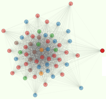
I gave an introduction to Natural Language Processing with python at the PDX python user group and showed how to use two of Bostock’s awesome graph optimization and visualization tools in his D3 library. Here’s a screenshot of one of my favorites:
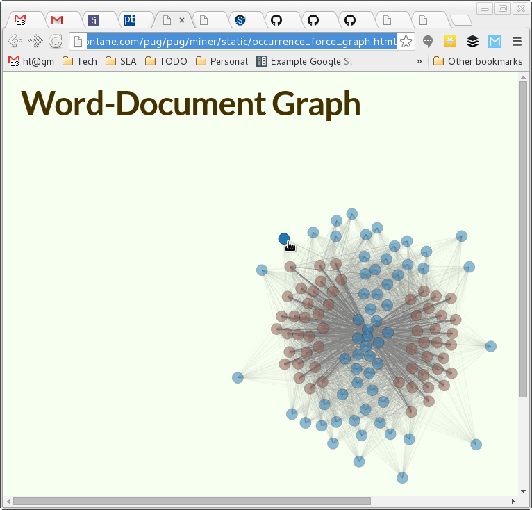
I showed how to do a quick-and-dirty frequency analysis of the US presidential inaugural speeches (available as one of the stock corpora in the NLTK package). Thank you, Lizhong for posing this interesting problem. He’s working on an unsupervised classification algorithm that he hopes will be able to classify the presidential speeches by the political party of their speaker. I’m taking my own approach here and don’t think it makes sense to expect unsupervised classification to produce any particular clustering that a human could dream up. But I like trying to figure out why the clusters came out the way they did. Check out the visualizations. What patterns do you see? Does this match what you expected to see?
Word counts were organized into a large, sparse matrix called an occurrence matrix (or TFIDF, in NLTK terminology). Python’s numpy library has plenty of SVD and other matrix manipulation functions that can help you reduce the dimensions of this huge matrix (the total vocabulary in all the speeches) into 100 or so of the most important terms and documents.
For this demo, and per the advice of Lizhong, I kept it simple and merely computed the entropy (“surprise” or information content or randomness) of the word frequency distributions across the speeches, to select the most interesting words. This approach leaves a lot of interesting information behind, but it’s a quick way to avoid having to chug through a massive SVD.
Search for…
…if you want to try a more sophisticated approach. Hint: These are all the same basic mathematical operation.
You can visualize this a lot of different ways, but two approaches of (Mike Bostock)[http://bl.ocks.org/mbostock] that I like are his “force directed graph” and just a plain old colorized matrix. Click around and see what you think. Can you guess which US Presidents will be the “outliers” in each of these visualizations? Hint: he’s Tricky.